Playing Card Design
I love classic card design, so a while back I designed an ace of spades, and more recently an ace of hearts. I’ve included both below. I hope to eventually design a full deck over the coming months, and I’ll post up my efforts as I go.

Brand Buildings
With the world economy going down the pan faster than a fat man that down to fast, banks have been closing and reporting loses left right and centre. Bank brands that once seemed so strong now appear frail and weak, with the biggest falling hardest.
I was on the Royal Bank of Scotland’s website the other day checking the money I didn’t have was still there, when I came across an article on their Daisy Wheel logo. I was struck by a comment they made about bank identity back in the 1940’s, before big logos and bigger brands:
“For the banks, it was more important to convey a message of solidity and stability (for example, through a handsome, stone-built branch in a prestigious location) than to create a unique identity”
Back then an impressive, solid building clearly reflected directly onto the business and brand that owned (or was perceived) to own it. Now every bank brand manager would sell his grandma if he could inject some “solidity and stability” into his banks image. Simply slapping a logo onto the front door isn’t gonna cut it.
Curiously many of the aforementioned handsome stone buildings can be seen in and around town and city centres across Britain, but in most cases all the branding they receive is the banks plastic logo speared into the stonework like an ill advised sky dish. I’m often left with a sense that these buildings will be around far longer than the banks that in habit them, which I imagine is far from the desired affect.
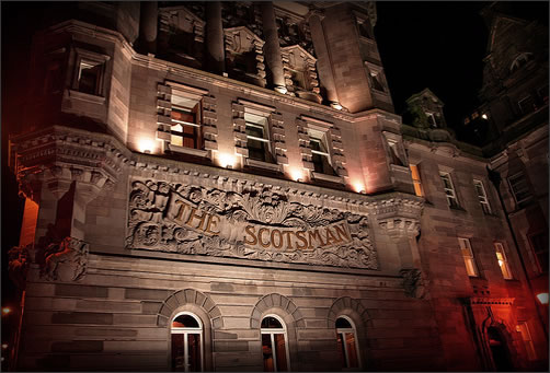
Contrast that with buildings that seem to have been built around the very logos of the business within and the affect can be quite powerful, giving a sense of real strength and longevity. The Scotsman building in Edinburgh is a great example.
Over the next two years, when big bank brands begin picking up the pieces of their shattered idenitites it would be good to see a more concentrated effort in improving the visual identities of their buildings. Banks might not have had the marketing budgets they do now, but in the ’40’s solidity and stability mattered above all else, something they’d do well to remember again.
Technorati Profile
No commentsRecent Logo Design
![]()
A logo I designed recently for a friends business, ayomedia in Newcastle. I’ve tried to make the design futuristic as well as give it a sense of speed.
The Strength of Branding
Brand strength is a term that gets pandered around a lot, and at times can seem like a vague and aloft marketing term, akin to “Thinking outside the box” or “360 degree solutions”, however recently I was given a stark example of how brand strength can affect perceived product quality, and reminded me how important building a strong brand can be.
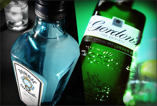
A friend of mine claims gin to be her staple poison of choice, and as we made our way to the beer shop she took great pride in telling me how, as good as Gordons Gin (£28.95 a bottle) is, it is considerably inferior to Bombay Sapphire (£38.94 a bottle). My reply?
“Bollocks! There’s no way you could tell the difference!”
Twenty minutes later we’re back at the flat and I’ve racked up 4 glasses, labeled A, B, C, and D, two with Gordons, two with Bombay Sapphire, and each with equal amounts of tonic added. How did she fair in this incredibly scientific blind test? She named two correctly, and got two wrong. Taking into account this fifty percent success rate (and ignoring the bruised pride) is it enough to justify the £10 difference between the two products? Probably yes, as it takes time to acquire the taste for gin subtleties (as with many premium products), and you can’t acquire that taste without buying the product many first.
What is startling though is how we let brands tell us and others that we have taste long before we’ve actually acquired it. An audiophile may explain in detail how their new B&W speakers sound better than cheaper models long before their ears have adjusted to the new sound, just as a fashionista might wax lyrical about the cut of a Saville Row suit when in reality a Top Shop suit feels identical.
As Wally Ollins said, people love brands, and understanding how a strong brand can affect how people see and project themselves now will help us to create and craft brands in the future.
No commentsDot Net Build Off
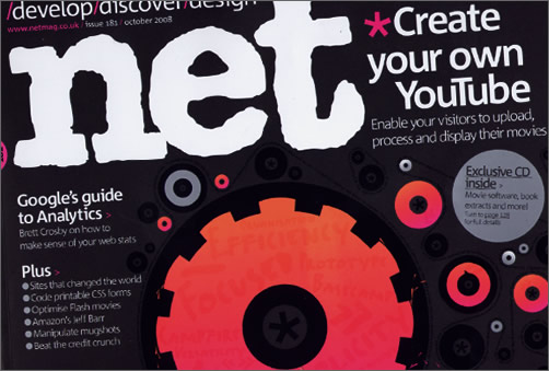
Last month our company was asked by .net Magazine to produce a design for their monthly “Build Off” feature, which boils down to three studios being given a fictional brief and creating a single homepage design to answer it. I’d like to talk about how I’m above such petty show-boating, and how I politely declined, saying that working for free (even for a publication) was a little unethical. However, as I’ve never had anything of mine published ever I nearly bit my managers hand off when he offered me the brief.
My efforts were included in the latest edition shown above (October, Issue 181), so if you fancy seeing my design as well as my fair and beautiful face pick up a copy in WHSmith and take a look.
5 commentsDesign Heroes
Many agencies both big and small have strict policies involving what their designers can and can’t display in online portfolios. The popular line seems to be “Display your personal work, but keep all in-house work offline”. That’s all good if your a junior (you’ll just be damn glad you’ve actually got a job), but without work online what can you show relatives that just think you “do computers”, or that fine art student your chatting up?
It’s not hard to see why agencies adopt this policy. It prevents moonlighting designers from passing off group agency work as their own, keeps below standard/NDA restricted work out of the public domain and stops marauding recruitment firms from directly poaching design talent.
However some agencies do let their top designers publish their work in personal portfolios, and the most notable are arguably some of the best agencies on the planet: AKQA, 2advanced and North Kingdom. Their portfolios are featured below:
http://www.killahgrafikz.com/ Kevin Hsieh (AKQA)
http://www.shanemielke.com/ Shane Mielke (2advanced)
http://www.designchapel.com/ Robert Lindstrom (North Kingdom)
By letting these designers show their work in their own light, they become design heroes that others follow and respect. It’s a symbiotic relationship between designer and studio. The designers are allowed to show off all they’ve achieved, gaining both industry and in-studio respect, while the agencies shine in the reflected glory of their top designers, effectively turning them into one man recruitment magnets. What designer wouldn’t want to work and learn alongside any one of these guys?
It be great to see more agencies follow suit. After all, what could be better for designer morale than letting the best show-off and giving the rest something to aim for?
1 comment
Recent Work
Hey troops, been insanely busy last month so blogging’s taken a back seat. I’ve got a fresh design for Breadline ready though so looking forward to getting that up and posting more regularly. In the mean time here’s a piece I’m still working on, keeping with the same style as my earlier illustration. I’ll post up the finished thing when its done. Cheers!

New Look’s New Look

Brand agency SomeOne have recently created a new logo and visual idenitiy for highstreet retailer New Look. According to their spokesperson the new identity will give “a mature direction to the brand positioning”. Not a bad move, as what they have currently is pretty young and feminine in a crowded teen market. What is surprising though is the timing.
With the price of living in the UK soaring, house prices falling and inflation rising perceived middle and high end brands have seen faltering sales. The masterful M&S rebrand was perfect for the economic climate of the time, but as shoppers lock down spending its the perceived budget brands such as Netto and Comet that are reaping the benefits. Suddenly looking cheap and cheerfull isn’t such a bad way to be.
Somehow “This isn’t just a recession, this is an M&S recession.” Isn’t gonna cut it.
Whether other major brands reposition themselves in the face of the brewing economic storm remains to be seen, but New Look’s brave rebrand will make an interesting study. Will a fresh face reinvogorate and inspire tired shoppers and sales? or serve to push New Look away from its target market when it needs it most?
1 commentOriginal Apple Logo
Procrastinating at work I came across Apples original logo, a bizarre and intricate illustration of Isaac Newton sat under a tree with the famous granny smith poised for a fall. It was great to see the where the Iconic mark came from, and nice to be reminded that even billion dollar tech companies once had impractical and over the top logos.
![]()
Recent Work
Ok I did this awhile back, but fancied putting it up anyway. Was a personal piece inspired by some great illustration I’d seen online.