OGC ReBrand
![]()
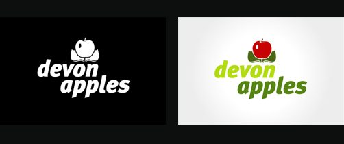
Those in the know will already have seen the OGC rebrand debacle. After splashing out a cool £14,000 on a fresh identity the suave government department have ended up with some serious egg on their face. The logo, when spun 180 degrees, reveals a comically explicit image of a man indulgeing in a five knuckle shuffle. In light of the embarrassing revelations an OGC spokesman said:
”It is true that it caused a few titters among some staff when viewed on its side, but on consideration we concluded that the effect was generic to the particular combination of the letters OGC - and it is not inappropriate to an organisation that’s looking to have a firm grip on Government spend”
A firm grip indeed. However when an identity becomes the laughing stock of the very staff at the centre of the brand, surely its time for a climb down? The poor spokesmen is right, the effect is generic of those letters, but surely simply boosting the kerning so the letters didn’t touch would go some way to easing the problem? A quick fix now would save the OGC years of internal and industry smirking. Clearly a little pride needs swallowed here.
This is the second government logo to come under fire in recent months. The Olympic logo was slain on sight and yet still endures. Perhaps the OGC brand managers believe their logo will survive in the same way. I wouldn’t bet on it though. The Olympic logo may be unpopular, but there is nothing inherently comical or obscene about it. I suspect we’ll see another quiet OGC rebrand shortly, and if not, another worthy inclusion in those “obscene logos” collections that do the rounds every few months.
1 commentAdding Brand Value
Using negative space in a logo can be a clever way of getting an extra concept across with minimum fuss. I’m a big fan of the technique, and have used it in the last few logo’s I’ve designed with varying success. Today at work though a debate started as to whether negative space logos were actually effective at conveying a graphical message, or simply pass unnoticed by the untrained eye.
Its a point worth considering. The arrow camouflaged in the FedEx logo is missed by nearly everyone who dosn’t design for a living, just as the iconic building nestled between the knife and fork of My Cuisine is only going to be obvious if you actually know the building, its location and its importance.
When hiding an object within negative space we’re asking the viewer to work that little bit harder to decipher the meaning, and we’re running the risk of having the trick being lost altogether. Despite this I think its worth taking the chance. Negative space logo’s still work when the colours are inverted, and only get stronger when in black and white. The trick can be subtle as in FedEx, or full on as in F1. Besides, many dual and triple concept logo’s ask that little bit more from the viewer, even without the use of negative space. A great example is that of Posh Boats, where a cursory glance shows a Fleur-de-lis, but a moment of consideration reveals a prow cutting through waves.

When a second logo concept isn’t obvious, but at the same time isn’t critical to the designs success, the logo slips into a special place, were the brand is accessible at face value, but has that little secret for those lucky enough to see it. The FedEx logo is rock solid without the knowledge of the arrow, just as the Posh Boats logo works if the actual boat is missed.
When a viewer does see the trick, that special design gem, there’s a moment where the brand and the viewer connect, a moment where the brand reaches out and touches them. Allright, it isn’t going to give them an orgasm, nor even make them reach out and buy the product, but what it will do is make the brand that little bit more memorable, that fraction more special. Once seen a design trick can’t be unseen.
It’s this moment, preloaded into a design that adds brand value. It’s what will separate your clients logo from the competition, and why the logo’s core concept will survive longer than the original artwork will.
2 commentsRecent Logo Work
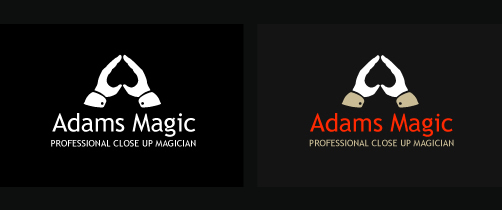
Logo for a local magician. I know I used the negative space trick on the wiggle logo, but It just felt right to use it here so went with it. The font is Trebuchet MS which is one of my favourites, its got a lovely “g” which adds a bit of character to the typeface.
5th Avenue Manchester

Last weekend I was doing some irresponsible drinking in Manchester and was having a ball, until we arrived at a sizable student club called 5th Avenue. After battling through the que and poaching a table I announced I was diving out for a sly cigarette and headed for the entrance, where I was promptly stopped by a man-mountain of a bouncer and told I needed a “Smoking Pass”, which was only available at the cloak room. Glancing down at the epic cloak que I gritted my teeth and went to stand in line. When I finally reached the front I was told the pass would cost me £1, and it entitled me to only four cigarettes, taking no longer than five minutes for each! She then wrapped and secured an ILLUMINOUS ORANGE BAND around my wrist. Not only was I paying a quid for the right to smoke, I’m limited to five minutes and have this glowing orange beacon attached branding me a smoker. At least finding someone with a lighter won’t be hard, a swift waist level glance across the club reveals all the other addicts. 5th Avenue justifies the £1 price “due to the cost of more people supervising the outside smoking area”
I’ve been smoking since I was 16 so I’m pretty good at it. I don’t really need supervision, and lets face it, if someone was being rowdy in the “smoking area” which is actually the cold Manchester street at the clubs entrance, the regular bouncers would just deny re-entry.
I’m all for the smoking ban. Forcing me into the god awfull British weather makes me smoke less, and can be a good place to meet fellow clubbers, but charging me for my addiction and then branding me for all to see well over steps the mark. If I was given a coloured band because I was gay, had a criminal record or HIV thered be a public outcry, so why when I’m a ciggarette addict? Lets hope 5th Avenue shifts its attitude towards smoking, because if branding segments of society becomes acceptable the future will be that little bit grimmer for all, not just us deplorable smokers.
2 commentsRecent Logo Work
A logo I designed for an online radio station. Difficult brief this one. The station will be aimed at a wide age group, and is as much about local community and support for young people as it is about music.
![]()
Webcam Navigation

I don’t often post up websites here, but having seen this site featured on the FWA I thought it was well worth pointing out.
http://www.hrp.com/
It’s one of the first websites to give the user the option to navigate through using a webcam as opposed to a mouse or keyboard. Granted it chugs abit, and the paint through water is an old trick, but the webcam navigation works impressivly well. In fact, once you’ve got the hang of sitting in the right spot and waving your hands around in the right fashion, you can’t help feel the Minority Report dream isn’t all that far away!
1 commentOverused Typefaces

Any idea what a metal magazine, an arctic adventure and an electro house night have in common? They’re all abusing the Base 02 typeface that I love to hate. When a new and unique typeface bursts onto the design scene It can be expected to proliferate like bunnies on viagra, I’ve no issue with that. What annoys me is when designers persistently use the typeface in place of actual design, letting the font do the work where a piece of original thinking would have proudly sat. Take Sam and Richard Bransons book Arctic Diary. Here was a great opportunity to create a clever, original title graphic showing the harshness of the arctic environment and the human struggle against the odds, instead we’re treated to an overused grunge font that we see at least five times a day on club flyer’s, CD covers and government anti-whatever adverts.
Like a DJ shunning that chart topper to play a gem of a record that few have heard but hits the spot, designers should take the time to explore the ever expanding font libraries to find the faces that will make their design unique, because the other option is recycling tired typefaces of yesteryear, and where’s the originality in that?
3 commentsDeath of the Dictionary Definition

cli•ché –noun
1. a trite, stereotyped expression; a sentence or phrase, usually expressing a popular or common thought or idea, that has lost originality, ingenuity, and impact by long overuse, as sadder but wiser, or strong as an ox.
2. anything that has become trite or commonplace through overuse.
Alright, next time I see the “dictionary definition as a graphic” technique on a flyer, bookcover, website, whatever, I’m gonna personally track the offending designer down and smack them over the head with a copy of Original Design for Dummies. This trick has been used so many times over the last five years that seeing it now is enough to make me hurl. It’s proliferated so much that yesterday when I innocently reached in my wallet to pay for a can of Irn Bru I was stabbed in the eye by the definition of 50 pence ON THE ACTUAL 50P!
When a design trick appears on the Queens currency you know its truly died a death. Guys (I’m looking at you, students) for the sake of original design, and my continued sanity, lets bury this trick alongside 3D spinning logos and Under Construction gifs, lest we as a community end up burning in design hell.
1 commentLatest Coke Can Design

Over the last few weeks Coca-Cola have rolled out their new look can over the UK. In true minimalist style they’ve stripped the design back to its bare brand bones, the name and a single flowing white line. Bevels, colours, shadows and supporting graphics have been cast aside in order to push the iconic two colour design and flowing stripe.
It’s a good move. The design is striking, if only because we’re so used to seeing the cylinder in its Saturday night best vying for attention next to its equally noisy shelf rivals. It harks back to Cokes southern American roots, and gives the can a real “classic” feel.
The re-design is most likely a strategic decision. Pepsi have gone to town of late with their cans clothing, and to go left when the opposition goes right is always a bold move, especially for a brand as weighty as Coca Cola. Such a change helps differentiate one brand from the next, but perhaps more importantly allows for a fresh canvas for whatever marketing move they make next, which in today’s ever changing society you can bet will be sooner rather than later.
No comments