Recent Work
This is a recent logo I designed for a Newcastle based company. They supply audio equipment for gigs, studios and clubs.
Xerox ReBrand
It’s great when huge companies make big brand changes. It gives brand designers a chance to see how big business view themselves in their current market place, it gives an indicator as to where the company sees itself going, and best of all you get to bear witness to the often hugely polarized online opinion, (which is always a great excuse to wade into a forum and lambaste a junior).
Xerox are the latest corporate behemoth to change face, casting aside the hard edged uppercase typeface of yesteryear in favour of a more huggable, smooth-edged, lowercase typeface of the moment. Even the famous pixel formed X icon has been shown the door, replaced by an abstract “X-Ball”, which I can’t help feel sits uncomfortably close to the Xbox 360 logo. The strong red remains however, being joined, we’re promised, by a variety of other brand colours across all media.
The rebrand seems to be well timed. I know little about the company, but thanks to some surprisingly straight-talking press releases from those involved it seems that it’s the right time for Xerox to update their image. Richard Wergan, vice president of their worldwide brand division states:
“Xerox is still perceived incorrectly as a copier company. We do not make copiers.”
Fair play. The change appears to be more than skin deep too, with one of their analysts, Angele Boyd saying:
“They have made significant changes in the last several years. Packaging and branding have not kept pace,”
All sounds good, however the motives for the re-brand have to be questioned. Xerox has worked hard to recover from heavy debt and financial scandal, yet their share price has yet to reflect this. If the rebrand is genuinely part of a concerted effort by Xerox to show the world they have evolved, then the I think the brand will become a success, and perhaps as Iconic as the identity they’ve discarded. However if the new brand values are not carried through to the heart of the company, and their previously flawed business model corrected in step, then this latest re-brand may be the final multi-million dollar shot in the arm which finishes Xerox off.
![]()
![]()
Relentless Measures
Softdrink giants Red Bull GmbH, based in Austria, have held an epic share of the global energy drinks market since the introduction of their now famous stimulation drink, Red Bull. Selling over 3 billion cans in 2006 and holding a 50% share of the US energy drinks market, they have come to dominate what was a lucrative but fringe drinks sector.
The Red Bull marketing engine is a study in success. From initially handing out cans for free to students (an exercise in viral marketing before it became sexy) they have gone on to sponsor and create marketing opportunities right across the skater chic / young professional sector, yet always concentrating on brand relevant activities. Examples include buying the Jaguar formula one team, to sponsoring a mad UK homemade cart race. They’ve even revived the air races of a bygone era, putting on a two day spectacle on London’s Thames river.
Clever design, an undiluted marketing message and great timing have been the key to the brands meteoric success. The brand is both masculine and clear, high energy but fun. The cans themselves have unusual dimensions, making them feel more like large batteries than fluid vessels, and the clear yet simple design gives the cans an almost medical look.
You’re not drinking it because your thirsty, your drinking it because you’ve got shit to do goddamit.
Success on this scale never goes unnoticed however, and the red giant that is Coca-Cola has decided to lumber into the market and ruffle some feathers. In 2005 it launched “Relentless”, and following in Red Bulls footsteps has begun sponsoring motocross teams and music events in order to gain ground amongst Red Bulls current buyer base.
Curiously Coke has gone to great lengths to keep the Relentless brand apart from the red softdrink that bears its name. Granted the name Coca-Cola Company appears on the can, but only in the small print near the base, an area that’ll go unread by most drinkers.
The can itself is twice the size of their Red Bull competitor (500ml compared to Red Bulls 250ml), and not by accident. Their strapline is “No Half Measures”. Red Bull have been quick to react launching a larger can, but still fall short at 330ml. What’s most interesting though is the design on the Relentless can itself. An elaborate gothic typeface sits atop an 1800’s styled medical illustration of a male head and neck, complete with exposed muscles and veins, and the supporting typeface is a medieval serifed font that wouldn’t look out of place on a tavern sign in middle earth.
Brave, to say the least. But perhaps not a bad move.
Product differentiation can be critical when establishing new brands, and there’s no doubt Relentless have pulled no punches in the opening rounds of the energy drink title fight. But Coke will have an uphill struggle ahead if they are to make a serious dent in Red Bulls dominance. They’ve tried to take chunks out of other drink markets before, sometimes with disastrous results, Coke water springs immediately to mind.
Coke will have to push the Relentless brand both hard and wide if they are to establish themselves as an alternative to Red Bull, and they’ll only be able to achieve this if they can nail down their brand message, which at the moment is ambiguous, even if their design is not. So brand junkies take note; If Relentless is a success it may well open the door for other brand competitors to follow suite, and if not, it will prove a valuable lesson in how not to attack a market leader.
No commentsTED Creativity
Here are a pair of links to two keynote speaches made at last years TED design conference. Both are around the twenty minute mark and both are absolutely brilliant. The first is Sir Ken Robinson talking about creativity in education, its both execptionally funny and insightful.
Sir Ken Robinson
The second features Paul Bennett talking about creativity in general, and uses many examples, including IKEA and the health service to show how different perspectives on a problem can lead to exceptional design solutions.
Paul Bennett
No commentsLaunching a brand
Big name high street brands come and go. Some, like Orange seem to go from strength to strength, others like Woolworths seem to just plod along and some, like the now defunct C&A die or leave British shores altogether. To stay ahead of the competition brands must continually evolve and occasionally reinvent themselves. Marks and Spencer are a great example of how a failing high street brand revolutionised its image and turned around profits.
When a big well know organisation re-brands they can of course hard launch their new identity, with much fanfare and promotion (as Marks and Spencers did), or soft launch, gradually making a smooth transition from old to new without alienating existing consumers. Deciding which style of launch shouldn’t be taken lightly; if the Olympic logo had been soft launched the media and public reaction would have been far less venomous than it was.
Often high street re-brands are long overdue. The Car Phone Warehouse has long needed to re-brand, as they are the market leader in high street mobile retail, and yet they don’t sell car phones, nor are their shops warehouses. The name clearly needs changing. Sure enough though, change is afoot, as they are now soft launching “The Phone House” in Britain, having already done so in Europe. What surprises me is how badly this launch is being handled. Several shops have changed their signs yet there is no printed literature, nor reference made on the website. The website itself features both old and new logos on the splash page at www.phonehouse.com yet no mention on www.carphonewarehouse.com . With Phones 4 U aggressively attacking the already saturated mobile market place, The Phone House needs to stop dithering and hard launch as soon as possible.
For all the money and time spent on branding and marketing it’s the consumers who decide which brands succeed and which fail, but if confusion and doubt over identity set in, competitors will be quick to punish. Get the strategy right and the brand will be rewarded with new life, and the company with new profits. Get it wrong and the work to undo the damage could be immense.
For more info on soft and hard launching this article on CRN is well worth a read.
2 commentsWhat’s in a name?
Omnipresent branding is a design must for hardware and electrical manufactures, and marketing departments will go to great lengths to keep the logo and name visible across the units and all related media. The name is obviously crucial as it is the buyers and owners first point of brand association. If you’ve just spent £600 on a new Sony hi-fi you can drop the name in conversation with pride, and those you’re talking to will know the brand even if they know little about the hardware. However it seems that many companies completely ignore the benefits of their brand name when actually naming the products themselves, a prime example of this is Yamaha’s product naming.
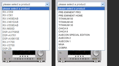
I’ve been thinking of putting some home cinema hardware in my living room for a while, and knowing Yamaha have a name for quality audio I thought I’d take a look at their line of AV Receivers. They offer twelve in total, the names of each unit are as follows: RX-V359, RX-V361, RX-V459DAB, RX-V461DAB, RX-V559DAB, RX-N600D, DSP-AX759SE, DSP-AX761, DSP-AX861SE, RX-V1700, RX-V2700 and DSP-Z9, All instantly forgettable and all telling me nothing about the product (the DAB being an exception). It’s even difficult to get an idea of which models are similar but higher spec, I’m guessing the RX-V361 is similar but better and more expensive than the RX-V359, but remembering the numerical difference between 361 and 359 is a chore. Marantz and Rotel are just as bad. If the products had decent names then they would be more memorable, both for when planning a purchase and talking about said purchase with friends. Below is a screen shot of the current product list (on left), and a fictional list (on right) that I believe would serve Yamaha much better.
In direct comparison Wharfedale’s range of speakers include the Airedale, the Evo 2, the Diamond 8 and the model up Diamond 9, the Opus and Crystal. These names are cool, sensible and add an intangible value to the product, allowing buyer’s to say “I own a pair of Diamond 9’s”, which makes the huge price tag that more palatable. Change is coming, mobile phones are slowly making the shift to memorable and cool sounding names such as the LG Chocolate and Viewty, the Samsung Viewty and of course the iPhone; their all names my mum can remember come Christmas time.
The iPhone deserves a special mention, as it’s the only mobile I know that actually describes itself in the name, the “i” represents apple without actually stating the name, the “Phone” describing what it is. In fact the iPhone name has transcended the company behind it. People tend to talk about the iPhone, not the Apple iPhone, the need to prefix the manufacture before model is gone. In contrast when talking about Nokia or Samsung phones I instinctively mention the manufacture before the model number, as its often needed just to let the person I’m talking to know the type of phone I’m refereeing to.
Letting engineers name products puts a barrier between the buyer and the brand, but simple, memorable, aspirational product naming goes miles in connecting the brand with both buyer and owner. Addressing poor product naming should be high on any brand strategists list of priorities, and if we as designers can show that there’s more to branding than just logo design, we can raise the value of what we do, and bring some simplicity and old fashioned common sense to the often confusing world of premium manufactured goods.
No commentsDesigner Interest Curve
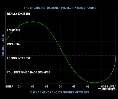
Working in a design studio can be both amazingly creative and inspiring, and at other times really dull and repetitive: I look forward to fresh design work, and loath endless image amends. But over the piece I’ve discovered that even when fresh work arrives, the initial excitement of the brief and first concepts can be quickly eroded by fussy clients and permanent design amends. I’ve seen fellow design colleagues go through the same thing, initially fired up for a fresh project, only to moan insistently about it five weeks and a thousand amends later.
This has inspired me to create the fantastic Breadline “Designer Project Interest Curve” in order to plot interest in a project over time. If any of you fellow designers experience the same thing when designing let me know so I know it isn’t just me!
Deleted…Again
Well the entire blog and database was deleted again. Fantastic. This time it was thanks to my piss poor host Webmania letting my account expire without any warning. Great. Word to the wise, avoid them at all costs lest you end up in disappearing blog hell.
No comments