Recent Logo Work
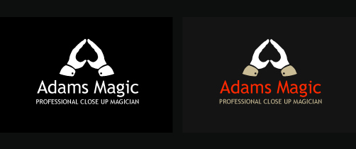
Logo for a local magician. I know I used the negative space trick on the wiggle logo, but It just felt right to use it here so went with it. The font is Trebuchet MS which is one of my favourites, its got a lovely “g” which adds a bit of character to the typeface.
5 Comments so far
Leave a reply
Like it matey, really good, as always. You could have doubled up the ’spade’ symbol inside the negative one and also created an ‘A’, probably too much though.
Agree with mike would be nice to have seen the ‘A’ in there and make it work on two levels. I’m a fan all the same.
Cheers guys. Would have been good to push the “A” aspect, but I’m guessing that making it look good would be a task for a more experienced designer than myself.
If your a fan of the “negative space” style here’s a great example that was featured in Design Week.
http://www.my-cuisine.co.uk/
Great job mate. Love the use of teh Negative space an dthe typface works well. Not too sure if you do need the ‘A’ in this. I think the spade is enough and keeps it clean and simple. Keep up.
But there is an A in there… isn’t that what the hands are spelling out? Plus a circus big top? Not to mention the close crop echoing the ‘close up’ in the tag. Brilliant work.