Conjure Logo
![]()
A recent logo I designed for start-up business Conjure. Specialising in design for mobile web and mobile applications I wanted to get away from the normal web2.0 look, opting instead for a deep purple and arcane typeface to mimic the magic theme that the name suggests.
4 commentsLogo Design
![]()
I designed this for a fitness company specialising in dance based routines. A barre is the rail that runs around a ballets dancers training studio.
1 commentLogo Design

This one was designed for a London based literary agency. They work across many creative fields, so I looked to the cave paintings of Lascaux in order to try and marry our civilizations earliest artistic efforts with the agencies creative vision.
1 commentLogo Design
![]()
I designed this logo for lighting designer and great friend Nick Harrison. The concepts an obvious one, but I felt it was fitting seeing as lighting is his profession. I’m also designing a blog for him and will post up a link when I get the thing finished.
6 commentsInteractive Media Award

A month or so back me and the team at Lightmaker designed and built a supporting site for Chelsea FC, and last week we were awarded an IMA “Best in Class” Award for our efforts. It coincided with my last day at Lightmaker, and gives me me an opportunity to say a massive thank you to those I worked with on the Chelsea project, and a farewell to the amazing group of people that make Lightmaker such a special place to work.
Logo Design
I designed this logo a while back but it didn’t get included after the last Breadline redesign. It’s a logo for an online gambling intelligence site, a place to get betting information on upcoming sports events. As the logo is for an online venture I wanted it to include an icon that can be used throughout the site as a brand piece.
1 commentCurrency Conundrum

Getting the train from Glasgow to London is always a dull, cramped and frequently sweaty affair, but the anticipation of unloading a wedge of Scottish bank notes on English shops always makes the journey that little more bearable. I look forward to arguing with stubborn store staff who refuse to take our “monopoly money”. It never fails to put a smile on my face.
For those not in the know, Scotland shares the same currency as England (pounds sterling) but unlike our southern friends we have not one bank printing notes but three, and not satisfied with three types of note, each bank produces variations to mark special events or to simply one-up the bank next door. The net result? More than 15 different types of bank note, a selection of them appear here.
I’m proud of Scotland’s individuality and believe a currency distinguished from England’s is a positive thing, however the excessive number of note designs in circulation surely serves to only to dilute national identity, make life easier for fraudsters and confuse the hell out of tourists.
South of the border Scottish currency is viewed with at best with suspicion, and worst flat rejection. The cause isn’t helped much by the law either with Scottish notes not actually being legal tender. It’s a great shame. Scotland already struggles with its identity, being known more for its past and poor health than its fast moving I.T and Medical industries (although rising stars like Andrew Murray and James Mcavoy are helping improve Scotland’s image). A confused currency isn’t Scotland’s only identity problem either, it still has two flags, and can’t decide on a national anthem.
The banks and devolved government need to get on top of currency design. Internationally currency is a nations business card. I can clearly picture an American dollar, could an American clearly picture one of the five Scottish fivers? Unifying currency design plays a small but important role in unifying a nations identity and it be great to see Scotlands updated and standardized, at least until we get the Euro, but that’s a whole other argument…
Design Company Naming Machine
Inspired by the ludicrous number of design studios using coloured animals as company names I’ve created the incredible fantabulous breadline design company naming machine. Follow the link and cast aside your tired and boring corporate name of yesteryear, embracing quirky naming wonderfullness! Huzzah!
23 commentsBranding Christmas
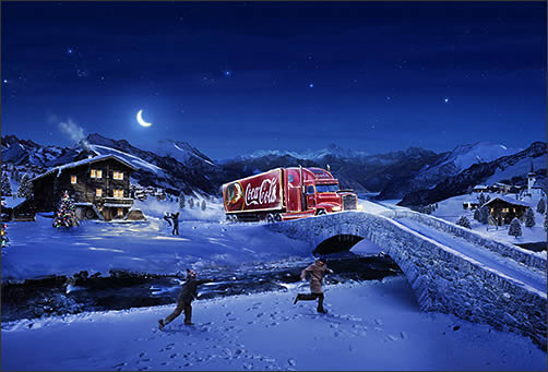
Two years back asking a ten year old when the Christmas season started they’d likely have said when the red trucks adorned with a soft drink supping santa hit the TV screens. These adverts have been replaced now, which i think was a big mistake. What Coke were close to achieveing with their annual Christmas TV campaign is nothing short of the brand Holy Grail: They were gradually attaching their brown sugary liquid to the birth of christ, and to the second happiest day of every child’s year. No mean feat by any means.
So how on earth were they managing this? In two ways. First they masterfully crafted a visually rich advert with a catchy tune, and secondly, but much more importantly they left it virtually unchanged and repeated it year after year after year. Combine this with the urban myth that they created the red Sana Claus and you have a very powerful campaign that was beginning to span a generation.
Coca Cola aren’t alone in their efforts to brand Christmas. Perfume behemoths Chanel now have their eyes firmly fixed on a similar Christmas tie in. Chanel’s advert, featuring a runaway Australian actress and an absurd star-gone-missing-meets-beautiful-no one plot is high budget, blunt with its message and gratuitous in its execution. Its also run unchanged annualy for three years. Give it another five and I bet I can tell you what Mrs Claus will be getting in her above average sized stocking.
However if you want an example of a brand that has truly owned a cultural event you need look no further than Guinness beer and Saint Patricks day. The beer and the day are becoming virtually one, with March the 17th punctuated with over sized Guinness hats, beer coasters and even Guinness branded parade floats in Dublin itself. Bombardier beer are attempting a similar cultural coup with St Georges day, although they have a real up hill struggle ahead, as the English are as attached to St Georges day as they are to the Eurovision song contest.
I’m probably not alone in finding these brands efforts to own cultural dates a little upsetting. I like the idea that certain cultural stories remain free of commercial exploitation and that we as a people will maintain and evolethem without the aid of multi-national capitalist giants. However in truth brands like Coke, Chanel and Guinness help push these events into the populations psyche far more than folklore can. Coke didnt invent a red Santa, but they did feature him on a hundred thousand posters. Can any non-commercial outfit claim the same?
I’m a realist. You can’t fight nor regulate any brands efforts to associate themselves with cultural events. Instead I’m going to controversially ask for more. Burns Night in my home country of Scotland is a fitting example. Year on year this wonderfully Scottish event fades a shade. Throughout my high school years I saw numbers dwindle every January the 25th, and down here in England the majority have never heard of it. If Bells Whiskey would simply throw some budget into pushing their brand onto this special date it’s profile would be raised and numbers at Burns Nights would grow. Many Scots might feel the day would be being exploited, but surely this is a fair price to pay for increased exposure?
Event branding is a difficult fact of modern life, a difficulty that’s here to stay. We as consumers can either reject it, and vote with our wallets, or embrace it and encourage other brands to back lesser events. Because if they don’t Burn’s night may one day be forgotten, or worse be branded with a Coke drinking Aussie wearing a Guinness shaped hat.
No comments
Woolworths on the Rocks

Today while weaving my way through a packed town shopping centre I caught sight of an over sized 50% off sign adorning a belegured Woolworth’s store. Being the credit-crunched designer that I am I wasn’t about to pass up on the chance of some cheap xmas pressies, and having seen the articles about the chains imminent demise I crossed the threshold and immersed my self in all things Woollies.
It’s been years since I’d visited Woolworths but It didn’t take long to see where the store was going wrong. Basic things were missing, like cleans floors and clear divides between product lines. To many of the shelves had vast empty gaps, and with no staff on the floor there was no one to ask for help in locating products. But the devils in the details, and here too they failed. The DVD’s didn’t have cellophane wrappers, giving the place a blockbuster feel, and the grubby HI-FI playing the in-store music was all to obvious behind the counter. Even the tired in-store branding felt wrong, with the red and greys harping back to a yester-year of beige PC’s and inflatable furniture.
The store should be the ultimate brand experience, the place where the consumer is literally “inside” the brand, and when details slide it’s not long before the experience suffers.
That said It’s easy to be negative, to point the finger and claim “I saw this coming” as many a neigh-sayer is currently saying. But in truth Woolworth’s biggest problem has been plain for all to see for some time: It never really new what it was, or more accurately, it never really came to terms with what it had become. As a generation of pick-n-mix kids matured into iTunes and Play.com shoppers, Woolworths continued blissfully unaware of the cultural shift beneath its feet, proffering to be a jack of all products instead of a master of one.
What’s worse is all the the warning signs of a consumer shift were there. Not two years earlier Halffords and Comet launched slick online stores and rebranded, aiming squarely at the lower end of their respective markets while. Marks and Spencers rebranded to hit the middle class shopper, and HMV streamlined it’s identity and introduced instore smoothies and Mac’s with internet access to entice the bebo generation. The best Woolworth’s managed was a short run TV ad campaign featuring a puppet called…wait for it…Wooly. No D&AD awards there then.
I hate seeing good brands fail. Every store knocked off our high streets is all to often replaced by another American equivalent, but when brand complacency sets in and the marketing message becomes confused a sticky end is all to often the outcome. Woolworth’s failure to consolidate their image and drive it to the public left them weak. Sadly it took a credit-crunch to finish them off.
9 comments