Archive for the 'Branding' Category
Media Logo Bashing Continued

Last week I defended the Tunbridge Wells Council’s decision to rebrand from a another knee-jerk media reaction, the majority of criticism seemingly leveled at the £18,500 price tag. The quality was also attacked, with the local paper pointing out that the new logo was by most standards a bit rubbish. They were right, but they failed to mention it was modern, the logos one saving grace. In contrast the previous logo belonged in an museum. The region needed a fresh face, and although the results were far from perfect, the time was right for a change.
Everyone has an opinion on the region they live in and the other regions of the country. On a local level we never really see the regions brand at work. We may occasionally see the logo in the local paper or the councils website, but it has very little effect on our day to day lives. Nationally however the picture is very different, and its on this stage that a modern identity starts to pay its dues.
Scotland is known for its countryside, Cambridgeshire its university and Manchester its football. Country, region and city, all with their own identities. They work hard to promote themselves nationally, though the locals rarely see it. You have to be in Glasgow to see a One North East advert, just as you need to watching the TV in England to see a Visit Scotland advert.
And Tunbridge Wells? It be foolish to think an area that small can do without a modern logo. With local I.T firms struggling to tempt talent away from London, and local initiatives such as Kent TV allowing new platforms for area promotion, now is the time for a new face. And as for the £18,500 price tag? This is logo for a region where a pint costs £3.70 and a house over £300,000. For the same price as a new ford focus the town can present a logo that although not award winning, at least won’t be receiving a telegram from the Queen any time soon.
No commentsMedia Logo Bashing
Why is it always bad logo design that makes the news? Tunbridge Wells Borough Council’s new logo is the latest logo to get publicly slammed, appearing on the front page of their local paper in what must have been a really slow news day in Kent.
Costing £18,500 the local paper is not happy, and as the logo is pretty rubbish, its understandable, but is it really becoming acceptable to blast design work this publicly? The new logo is bad, but it is at least newer than the one it replaced, which had past its sell-by-date a decade ago. It seems since the Olympic logo was so brutally mauled the media has had free reign to decide what is good and bad value.
The situation isn’t helped by biased coverage. Headlines always make the price out to be for the logo alone, disregarding the consultancy, research and multiple concepts that come hand in hand with rebrands. Councils are big organizations, and getting buy-in from all parties on a new design would be a stressfully slow process. The paper decided to add a cutting insult to mild injury, stating “They would have been better off asking residents to submit their own ideas”.
Nice. Maybe next time there’s a power cut they should ask residents to submit their own batteries.
This media attitude sets a bad precedent for freelance logo designers. If the public (aided by the media) believe their design skills rival established professionals, then the perceived value of design drops, and when that happens the lower end of the logo market suffers. Big brands understand the need for professional branding, but does the local plumber and the high street nail salon? It’s clients like these that keep freelancers and small design business’s alive, and if their local paper is trivializing brand design then its people like them who suffer.
Public awareness of the true cost of branding needs to be raised if the tide of negative publicity is to be turned. Logo design is one of the smallest parts of a brand, but if the media continue to make out to be the biggest then the logo design industry will face a turbulent future.
No commentsSolution Polution

Using the word Solution in a brand name has long been a pet hate of mine, annoying me to the point that in the past I used to post up the Private Eye’s weekly absurd solutions list on Breadline in an attempt to highlight the vulgar practice. Sadly it continues so I’ve felt the need to reiterate why using the term is as disgracefull as OAP tipping and global warming.
I first clocked the term ”solution” at the tail end of my uni years, and yeah I’ll admit, back then it was a useful word for fleshing out terrible proposals. My final project was titled ”An Integrated Dynamic Block Stacking Solution”, which I felt had a far better ring to it than “Tetris Reskin”
These days business’s both big and small use the term to over-describe whatever product or service their trying to push. This can be forgiven, but putting Solution in the actual business name is truly a crime, as not only does it tell us nothing about the product/service, but will consign the name to the ranks of the hundred thousand other small business’s that couldn’t be arsed to come up with an original name. My favourite example is Pasta Solutions “The Ultimate Solution To Your Pasta Needs!” What was wrong with simply ”Perfect Pasta” ?
Using “Solution” might sound vaguely professional, but have you ever actually thought, ”I have a cooking problem, I need a Cooking Solution” Of course not. We don’t think in management speak, so why name business’s this way?
If a client comes to you for an identity and they propose a name that includes the S word, it’s worth going out of your way to turn them round. Explain to them that thousands of business’s use the same word in their title, tell them that the word doesn’t actually mean anything, that they’ll have a search engine nightmare, and that it saps personality from a potentially vibrant brand. If they still insist use Helvetica for the typeface, add a corporate swoosh graphic and the strap-line “Thinking Outside the Box”. Then double your fee. They’ll love you for it.
3 comments
OGC ReBrand
![]()
Those in the know will already have seen the OGC rebrand debacle. After splashing out a cool £14,000 on a fresh identity the suave government department have ended up with some serious egg on their face. The logo, when spun 180 degrees, reveals a comically explicit image of a man indulgeing in a five knuckle shuffle. In light of the embarrassing revelations an OGC spokesman said:
”It is true that it caused a few titters among some staff when viewed on its side, but on consideration we concluded that the effect was generic to the particular combination of the letters OGC - and it is not inappropriate to an organisation that’s looking to have a firm grip on Government spend”
A firm grip indeed. However when an identity becomes the laughing stock of the very staff at the centre of the brand, surely its time for a climb down? The poor spokesmen is right, the effect is generic of those letters, but surely simply boosting the kerning so the letters didn’t touch would go some way to easing the problem? A quick fix now would save the OGC years of internal and industry smirking. Clearly a little pride needs swallowed here.
This is the second government logo to come under fire in recent months. The Olympic logo was slain on sight and yet still endures. Perhaps the OGC brand managers believe their logo will survive in the same way. I wouldn’t bet on it though. The Olympic logo may be unpopular, but there is nothing inherently comical or obscene about it. I suspect we’ll see another quiet OGC rebrand shortly, and if not, another worthy inclusion in those “obscene logos” collections that do the rounds every few months.
1 commentAdding Brand Value
Using negative space in a logo can be a clever way of getting an extra concept across with minimum fuss. I’m a big fan of the technique, and have used it in the last few logo’s I’ve designed with varying success. Today at work though a debate started as to whether negative space logos were actually effective at conveying a graphical message, or simply pass unnoticed by the untrained eye.
Its a point worth considering. The arrow camouflaged in the FedEx logo is missed by nearly everyone who dosn’t design for a living, just as the iconic building nestled between the knife and fork of My Cuisine is only going to be obvious if you actually know the building, its location and its importance.
When hiding an object within negative space we’re asking the viewer to work that little bit harder to decipher the meaning, and we’re running the risk of having the trick being lost altogether. Despite this I think its worth taking the chance. Negative space logo’s still work when the colours are inverted, and only get stronger when in black and white. The trick can be subtle as in FedEx, or full on as in F1. Besides, many dual and triple concept logo’s ask that little bit more from the viewer, even without the use of negative space. A great example is that of Posh Boats, where a cursory glance shows a Fleur-de-lis, but a moment of consideration reveals a prow cutting through waves.

When a second logo concept isn’t obvious, but at the same time isn’t critical to the designs success, the logo slips into a special place, were the brand is accessible at face value, but has that little secret for those lucky enough to see it. The FedEx logo is rock solid without the knowledge of the arrow, just as the Posh Boats logo works if the actual boat is missed.
When a viewer does see the trick, that special design gem, there’s a moment where the brand and the viewer connect, a moment where the brand reaches out and touches them. Allright, it isn’t going to give them an orgasm, nor even make them reach out and buy the product, but what it will do is make the brand that little bit more memorable, that fraction more special. Once seen a design trick can’t be unseen.
It’s this moment, preloaded into a design that adds brand value. It’s what will separate your clients logo from the competition, and why the logo’s core concept will survive longer than the original artwork will.
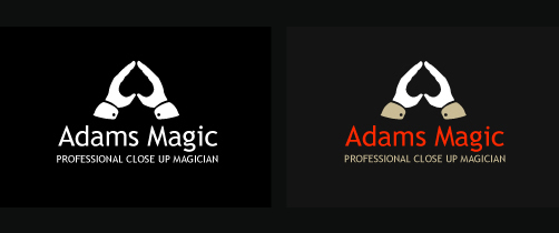
2 commentsRecent Logo Work
Logo for a local magician. I know I used the negative space trick on the wiggle logo, but It just felt right to use it here so went with it. The font is Trebuchet MS which is one of my favourites, its got a lovely “g” which adds a bit of character to the typeface.
Latest Coke Can Design

Over the last few weeks Coca-Cola have rolled out their new look can over the UK. In true minimalist style they’ve stripped the design back to its bare brand bones, the name and a single flowing white line. Bevels, colours, shadows and supporting graphics have been cast aside in order to push the iconic two colour design and flowing stripe.
It’s a good move. The design is striking, if only because we’re so used to seeing the cylinder in its Saturday night best vying for attention next to its equally noisy shelf rivals. It harks back to Cokes southern American roots, and gives the can a real “classic” feel.
The re-design is most likely a strategic decision. Pepsi have gone to town of late with their cans clothing, and to go left when the opposition goes right is always a bold move, especially for a brand as weighty as Coca Cola. Such a change helps differentiate one brand from the next, but perhaps more importantly allows for a fresh canvas for whatever marketing move they make next, which in today’s ever changing society you can bet will be sooner rather than later.
No commentsXerox ReBrand
It’s great when huge companies make big brand changes. It gives brand designers a chance to see how big business view themselves in their current market place, it gives an indicator as to where the company sees itself going, and best of all you get to bear witness to the often hugely polarized online opinion, (which is always a great excuse to wade into a forum and lambaste a junior).
Xerox are the latest corporate behemoth to change face, casting aside the hard edged uppercase typeface of yesteryear in favour of a more huggable, smooth-edged, lowercase typeface of the moment. Even the famous pixel formed X icon has been shown the door, replaced by an abstract “X-Ball”, which I can’t help feel sits uncomfortably close to the Xbox 360 logo. The strong red remains however, being joined, we’re promised, by a variety of other brand colours across all media.
The rebrand seems to be well timed. I know little about the company, but thanks to some surprisingly straight-talking press releases from those involved it seems that it’s the right time for Xerox to update their image. Richard Wergan, vice president of their worldwide brand division states:
“Xerox is still perceived incorrectly as a copier company. We do not make copiers.”
Fair play. The change appears to be more than skin deep too, with one of their analysts, Angele Boyd saying:
“They have made significant changes in the last several years. Packaging and branding have not kept pace,”
All sounds good, however the motives for the re-brand have to be questioned. Xerox has worked hard to recover from heavy debt and financial scandal, yet their share price has yet to reflect this. If the rebrand is genuinely part of a concerted effort by Xerox to show the world they have evolved, then the I think the brand will become a success, and perhaps as Iconic as the identity they’ve discarded. However if the new brand values are not carried through to the heart of the company, and their previously flawed business model corrected in step, then this latest re-brand may be the final multi-million dollar shot in the arm which finishes Xerox off.
![]()
![]()
Relentless Measures
Softdrink giants Red Bull GmbH, based in Austria, have held an epic share of the global energy drinks market since the introduction of their now famous stimulation drink, Red Bull. Selling over 3 billion cans in 2006 and holding a 50% share of the US energy drinks market, they have come to dominate what was a lucrative but fringe drinks sector.
The Red Bull marketing engine is a study in success. From initially handing out cans for free to students (an exercise in viral marketing before it became sexy) they have gone on to sponsor and create marketing opportunities right across the skater chic / young professional sector, yet always concentrating on brand relevant activities. Examples include buying the Jaguar formula one team, to sponsoring a mad UK homemade cart race. They’ve even revived the air races of a bygone era, putting on a two day spectacle on London’s Thames river.
Clever design, an undiluted marketing message and great timing have been the key to the brands meteoric success. The brand is both masculine and clear, high energy but fun. The cans themselves have unusual dimensions, making them feel more like large batteries than fluid vessels, and the clear yet simple design gives the cans an almost medical look.
You’re not drinking it because your thirsty, your drinking it because you’ve got shit to do goddamit.
Success on this scale never goes unnoticed however, and the red giant that is Coca-Cola has decided to lumber into the market and ruffle some feathers. In 2005 it launched “Relentless”, and following in Red Bulls footsteps has begun sponsoring motocross teams and music events in order to gain ground amongst Red Bulls current buyer base.
Curiously Coke has gone to great lengths to keep the Relentless brand apart from the red softdrink that bears its name. Granted the name Coca-Cola Company appears on the can, but only in the small print near the base, an area that’ll go unread by most drinkers.
The can itself is twice the size of their Red Bull competitor (500ml compared to Red Bulls 250ml), and not by accident. Their strapline is “No Half Measures”. Red Bull have been quick to react launching a larger can, but still fall short at 330ml. What’s most interesting though is the design on the Relentless can itself. An elaborate gothic typeface sits atop an 1800’s styled medical illustration of a male head and neck, complete with exposed muscles and veins, and the supporting typeface is a medieval serifed font that wouldn’t look out of place on a tavern sign in middle earth.
Brave, to say the least. But perhaps not a bad move.
Product differentiation can be critical when establishing new brands, and there’s no doubt Relentless have pulled no punches in the opening rounds of the energy drink title fight. But Coke will have an uphill struggle ahead if they are to make a serious dent in Red Bulls dominance. They’ve tried to take chunks out of other drink markets before, sometimes with disastrous results, Coke water springs immediately to mind.
Coke will have to push the Relentless brand both hard and wide if they are to establish themselves as an alternative to Red Bull, and they’ll only be able to achieve this if they can nail down their brand message, which at the moment is ambiguous, even if their design is not. So brand junkies take note; If Relentless is a success it may well open the door for other brand competitors to follow suite, and if not, it will prove a valuable lesson in how not to attack a market leader.
No comments