Archive for April, 2008
Adding Brand Value
Using negative space in a logo can be a clever way of getting an extra concept across with minimum fuss. I’m a big fan of the technique, and have used it in the last few logo’s I’ve designed with varying success. Today at work though a debate started as to whether negative space logos were actually effective at conveying a graphical message, or simply pass unnoticed by the untrained eye.
Its a point worth considering. The arrow camouflaged in the FedEx logo is missed by nearly everyone who dosn’t design for a living, just as the iconic building nestled between the knife and fork of My Cuisine is only going to be obvious if you actually know the building, its location and its importance.
When hiding an object within negative space we’re asking the viewer to work that little bit harder to decipher the meaning, and we’re running the risk of having the trick being lost altogether. Despite this I think its worth taking the chance. Negative space logo’s still work when the colours are inverted, and only get stronger when in black and white. The trick can be subtle as in FedEx, or full on as in F1. Besides, many dual and triple concept logo’s ask that little bit more from the viewer, even without the use of negative space. A great example is that of Posh Boats, where a cursory glance shows a Fleur-de-lis, but a moment of consideration reveals a prow cutting through waves.

When a second logo concept isn’t obvious, but at the same time isn’t critical to the designs success, the logo slips into a special place, were the brand is accessible at face value, but has that little secret for those lucky enough to see it. The FedEx logo is rock solid without the knowledge of the arrow, just as the Posh Boats logo works if the actual boat is missed.
When a viewer does see the trick, that special design gem, there’s a moment where the brand and the viewer connect, a moment where the brand reaches out and touches them. Allright, it isn’t going to give them an orgasm, nor even make them reach out and buy the product, but what it will do is make the brand that little bit more memorable, that fraction more special. Once seen a design trick can’t be unseen.
It’s this moment, preloaded into a design that adds brand value. It’s what will separate your clients logo from the competition, and why the logo’s core concept will survive longer than the original artwork will.
2 commentsRecent Logo Work
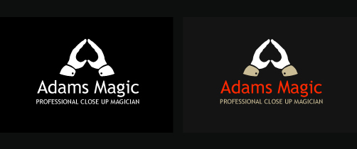
Logo for a local magician. I know I used the negative space trick on the wiggle logo, but It just felt right to use it here so went with it. The font is Trebuchet MS which is one of my favourites, its got a lovely “g” which adds a bit of character to the typeface.
5th Avenue Manchester

Last weekend I was doing some irresponsible drinking in Manchester and was having a ball, until we arrived at a sizable student club called 5th Avenue. After battling through the que and poaching a table I announced I was diving out for a sly cigarette and headed for the entrance, where I was promptly stopped by a man-mountain of a bouncer and told I needed a “Smoking Pass”, which was only available at the cloak room. Glancing down at the epic cloak que I gritted my teeth and went to stand in line. When I finally reached the front I was told the pass would cost me £1, and it entitled me to only four cigarettes, taking no longer than five minutes for each! She then wrapped and secured an ILLUMINOUS ORANGE BAND around my wrist. Not only was I paying a quid for the right to smoke, I’m limited to five minutes and have this glowing orange beacon attached branding me a smoker. At least finding someone with a lighter won’t be hard, a swift waist level glance across the club reveals all the other addicts. 5th Avenue justifies the £1 price “due to the cost of more people supervising the outside smoking area”
I’ve been smoking since I was 16 so I’m pretty good at it. I don’t really need supervision, and lets face it, if someone was being rowdy in the “smoking area” which is actually the cold Manchester street at the clubs entrance, the regular bouncers would just deny re-entry.
I’m all for the smoking ban. Forcing me into the god awfull British weather makes me smoke less, and can be a good place to meet fellow clubbers, but charging me for my addiction and then branding me for all to see well over steps the mark. If I was given a coloured band because I was gay, had a criminal record or HIV thered be a public outcry, so why when I’m a ciggarette addict? Lets hope 5th Avenue shifts its attitude towards smoking, because if branding segments of society becomes acceptable the future will be that little bit grimmer for all, not just us deplorable smokers.
2 comments