Archive for the 'Design' Category
Recent Logo Work
A logo I designed for an online radio station. Difficult brief this one. The station will be aimed at a wide age group, and is as much about local community and support for young people as it is about music.
![]()
Webcam Navigation
I don’t often post up websites here, but having seen this site featured on the FWA I thought it was well worth pointing out.
http://www.hrp.com/
It’s one of the first websites to give the user the option to navigate through using a webcam as opposed to a mouse or keyboard. Granted it chugs abit, and the paint through water is an old trick, but the webcam navigation works impressivly well. In fact, once you’ve got the hang of sitting in the right spot and waving your hands around in the right fashion, you can’t help feel the Minority Report dream isn’t all that far away!
1 commentOverused Typefaces

Any idea what a metal magazine, an arctic adventure and an electro house night have in common? They’re all abusing the Base 02 typeface that I love to hate. When a new and unique typeface bursts onto the design scene It can be expected to proliferate like bunnies on viagra, I’ve no issue with that. What annoys me is when designers persistently use the typeface in place of actual design, letting the font do the work where a piece of original thinking would have proudly sat. Take Sam and Richard Bransons book Arctic Diary. Here was a great opportunity to create a clever, original title graphic showing the harshness of the arctic environment and the human struggle against the odds, instead we’re treated to an overused grunge font that we see at least five times a day on club flyer’s, CD covers and government anti-whatever adverts.
Like a DJ shunning that chart topper to play a gem of a record that few have heard but hits the spot, designers should take the time to explore the ever expanding font libraries to find the faces that will make their design unique, because the other option is recycling tired typefaces of yesteryear, and where’s the originality in that?
3 commentsDeath of the Dictionary Definition

cli•ché –noun
1. a trite, stereotyped expression; a sentence or phrase, usually expressing a popular or common thought or idea, that has lost originality, ingenuity, and impact by long overuse, as sadder but wiser, or strong as an ox.
2. anything that has become trite or commonplace through overuse.
Alright, next time I see the “dictionary definition as a graphic” technique on a flyer, bookcover, website, whatever, I’m gonna personally track the offending designer down and smack them over the head with a copy of Original Design for Dummies. This trick has been used so many times over the last five years that seeing it now is enough to make me hurl. It’s proliferated so much that yesterday when I innocently reached in my wallet to pay for a can of Irn Bru I was stabbed in the eye by the definition of 50 pence ON THE ACTUAL 50P!
When a design trick appears on the Queens currency you know its truly died a death. Guys (I’m looking at you, students) for the sake of original design, and my continued sanity, lets bury this trick alongside 3D spinning logos and Under Construction gifs, lest we as a community end up burning in design hell.
1 commentRecent Work
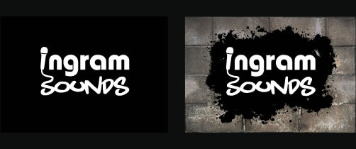
This is a recent logo I designed for a Newcastle based company. They supply audio equipment for gigs, studios and clubs.
TED Creativity
Here are a pair of links to two keynote speaches made at last years TED design conference. Both are around the twenty minute mark and both are absolutely brilliant. The first is Sir Ken Robinson talking about creativity in education, its both execptionally funny and insightful.
Sir Ken Robinson
The second features Paul Bennett talking about creativity in general, and uses many examples, including IKEA and the health service to show how different perspectives on a problem can lead to exceptional design solutions.
Paul Bennett
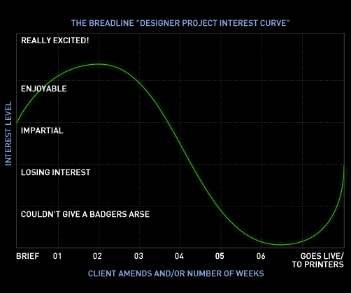
No commentsDesigner Interest Curve
Working in a design studio can be both amazingly creative and inspiring, and at other times really dull and repetitive: I look forward to fresh design work, and loath endless image amends. But over the piece I’ve discovered that even when fresh work arrives, the initial excitement of the brief and first concepts can be quickly eroded by fussy clients and permanent design amends. I’ve seen fellow design colleagues go through the same thing, initially fired up for a fresh project, only to moan insistently about it five weeks and a thousand amends later.
This has inspired me to create the fantastic Breadline “Designer Project Interest Curve” in order to plot interest in a project over time. If any of you fellow designers experience the same thing when designing let me know so I know it isn’t just me!